Plotly for College Analysis
By Jamel Thomas
Community colleges for many is a stepping stone to a larger dream of four year university. However, many of the risk factors that prevent students from succeeding in school are highly prevelant in the student body of 2-year institutions.
In this post, we explore open college data. This dataset includes the name of the college, the aggregated number of people who passed a particular subject by transfer level and race. The data itself contains information on race, and college name. It also contains information on the pass rate/number of students who passed by subject.
Let’s read our data and take a look:
There is a wonderful package called DT that creates interactive plots in HTML. It even comes with a search feature. Check it out.
#Load Packages:
require(DT)
## Loading required package: DTrequire(plotly)## Loading required package: plotly## Loading required package: ggplot2##
## Attaching package: 'plotly'## The following object is masked from 'package:ggplot2':
##
## last_plot## The following object is masked from 'package:stats':
##
## filter## The following object is masked from 'package:graphics':
##
## layoutschool <- read.table(url, header = T)ggplot
The ggplot package is essentially the bread and butter of beautiful and easy to use plots. We will start with data = school (duh), and x = ethnicity, y = sum. The “sum”" here is just the total number of students who passed given course.
g <- ggplot(data = school,
            aes(x = ethnicity, y = sum, fill = group)) + geom_boxplot() +
  theme(axis.text.x = element_text(angle = 90, hjust = 1)) #Vertical Axis
g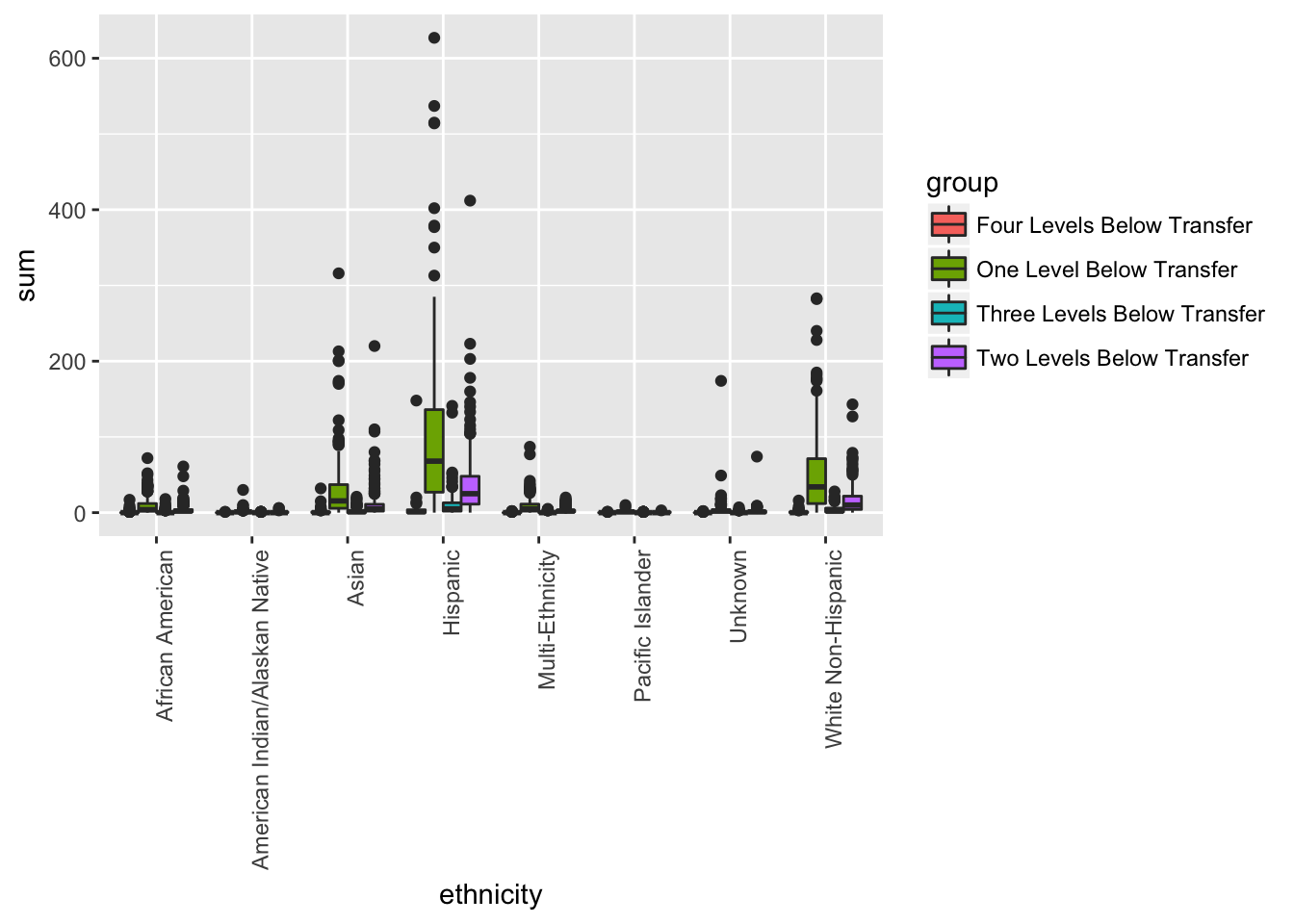
Interactivity
In order to make this plot interactive, we have to do something really challenging. Are you ready? Here we go…
Type the following line of code.
ggplotly(g)## We recommend that you use the dev version of ggplot2 with `ggplotly()`
## Install it with: `devtools::install_github('hadley/ggplot2')`That’s it! We can now do all sorts of amazing plots with minimal code! Let’s look as some more stuff.
g <- ggplot(data = school,
            aes(x = ethnicity, y = success, fill = ethnicity)) +
  geom_bar(stat = "identity")  +
  theme(axis.text.x = element_text(angle = 90, hjust = 1)) #Vertical Axis
ggplotly(g)
## We recommend that you use the dev version of ggplot2 with `ggplotly()`
## Install it with: `devtools::install_github('hadley/ggplot2')`Make sure you clean your data!
#Refactor
school$group <- factor(school$group,
                       levels = c("One Level Below Transfer",
                                  "Two Levels Below Transfer",
                                  "Three Levels Below Transfer",
                                  "Four Levels Below Transfer"))

g <- ggplot(data = school,
            aes(x = students, y = sum, color = ethnicity)) +
  geom_point() + facet_wrap( ~ group, ncol=2)
ggplotly(g)
## We recommend that you use the dev version of ggplot2 with `ggplotly()`
## Install it with: `devtools::install_github('hadley/ggplot2')`g <- ggplot(data = school,
aes(x = subject, y = sum, color = ethnicity)) +
geom_boxplot() + facet_wrap( ~ ethnicity, ncol=2)
ggplotly(g)## We recommend that you use the dev version of ggplot2 with `ggplotly()`
## Install it with: `devtools::install_github('hadley/ggplot2')`g <- ggplot(data = school,
aes(x = group, y = sum, fill = subject)) +
geom_boxplot() + facet_wrap( ~ subject, ncol=2)+
theme(axis.text.x = element_text(angle = 90, hjust = 1)) #Vertical Axis
ggplotly(g)## We recommend that you use the dev version of ggplot2 with `ggplotly()`
## Install it with: `devtools::install_github('hadley/ggplot2')`